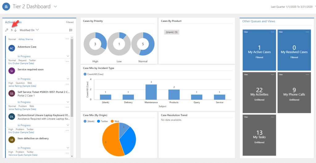
Interactive Dashboards in Dynamics 365 are highly valuable and offer crucial business insights into the data. However, I encountered an issue recently where the chart counts did not align with the stream counts. While the dashboard displayed the accurate data on the development server, the production server failed to reflect the correct chart counts in comparison to the stream (Grid on the left side). It’s important to note that the stream did display the correct counts, but the individual chart components did not.
Creating a new interactive dashboard fixed the problem, however I had end-users creating customized filters and I didn’t want to have to train them on how to recreate the filters.
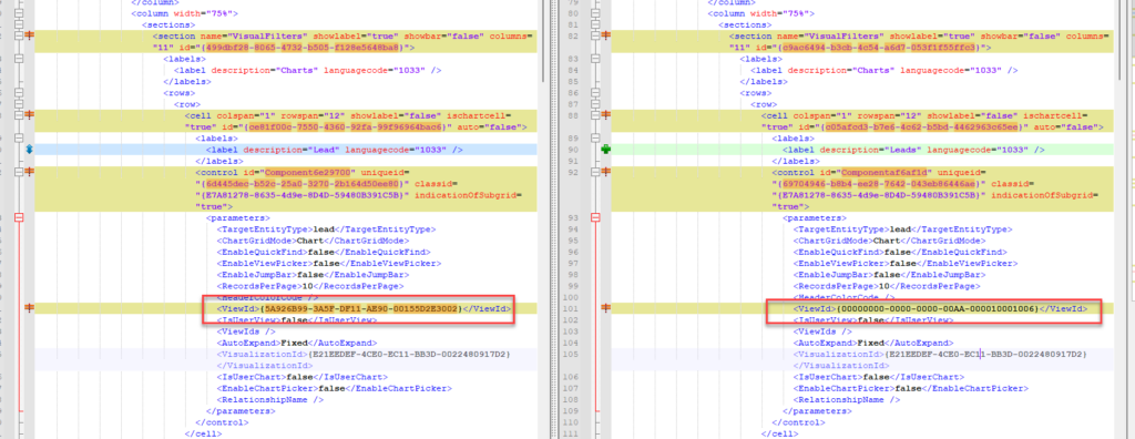
I decided to create a new solution with just the dashboard component and compare the solutions between the development copy and production copy. My handy Notepad++ compare utility showed me what’s different. Somehow during the deployment to production, the default view was pointing to a different GUID. I repackaged the solution and deployed to production and it started working again. Hopefully this will help others.